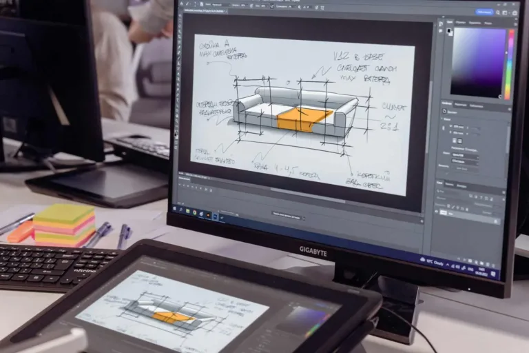
Graphic design has become an essential skill in the advertising and marketing industry, as it allows brands to effectively promote themselves through visually appealing designs.
By incorporating creative and eye-catching graphics, designers can capture the attention of their target audience and showcase their innovative skills.
To pursue a successful career in this field, aspiring designers must understand the core fundamentals and basic principles of graphic design.
The four core fundamentals of graphic design enable designers to create a sense of harmony and coherence in their work by ensuring that elements are evenly distributed, aligned correctly, organized hierarchically based on importance or relevance, contrasting effectively to draw attention where needed, and flowing smoothly with a consistent rhythm.
Additionally, understanding the principles help designers to further enhance their designs by utilizing concepts like proximity to create visual relationships between elements or using color strategically to evoke specific emotions or convey messages.
With this knowledge at hand – along with courses that cover branding and computer graphics – a designer can unlock endless possibilities for innovation in the world of graphic design.
Understanding Graphic Design
Graphic design is a creative and practical field that involves the use of visual elements, typography, and images to convey a message or communicate information. It is a form of visual communication that combines art and technology to create visually appealing and effective designs.
Graphic design plays a crucial role in modern business success by creating visually appealing marketing materials, such as logos, mobile apps, and social media pages, that effectively inform, educate, and persuade the target audience.
Over the years, it has evolved significantly thanks to advancements in technology and of course the evolution of design techniques.

The fundamentals provide a framework for designers to work with in order to create cohesive and impactful visuals no matter how much technology changes. While the core principles of graphic design serve as guidelines for designers to follow when creating their designs.
Understanding the fundamentals of graphic design is crucial for any aspiring graphic designer. By mastering these principles and incorporating them into their work, designers are able to create visually pleasing designs that effectively communicate messages and evoke desired emotions.
The Core Fundamentals of Graphic Design
This discussion will focus on the core fundamentals of graphic design, specifically typography, color theory, shapes, sizes & proportions, layout and composition, and image editing.
Typography
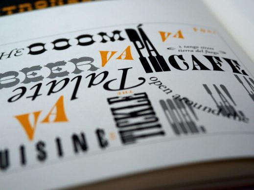
Typography, a fundamental aspect of graphic design, involves the art and technique of arranging type to make written language legible, readable, and visually appealing. It is an essential element in graphic design that plays a crucial role in conveying messages effectively.
Typography encompasses various aspects such as font selection, font size, line spacing, and letter spacing. Each of these elements contributes to the overall readability and aesthetic appeal of the design.
In graphic design fundamentals, typography is given significant importance as it directly influences how information is perceived by the audience. The choice of fonts can evoke different emotions or convey specific meanings.
For example, a bold and modern font may be suitable for a tech company’s logo to represent innovation and sleekness. On the other hand, a script font may be more appropriate for a wedding invitation to bring elegance and romance. Designers need to carefully consider these factors when selecting typography for their designs.
Furthermore, understanding design principles is crucial in using typography effectively. Principles such as hierarchy help designers establish visual order by assigning different levels of importance to text elements through variations in size, weight, or color. Alignment ensures that text elements are properly positioned relative to each other and other design elements on the page.
Overall, mastering typography is vital for graphic designers as it forms the foundation of visual design. By utilizing proper typographic techniques and principles within their designs, designers can create impactful visuals that effectively communicate messages while maintaining aesthetic appeal.
Color Theory
Color theory plays a pivotal role in graphic design as it explores the psychological and emotional impact of different colors, enabling designers to effectively convey specific messages and create visually appealing compositions.

Through color theory, designers are able to strategically select colors that align with the intended message and brand identity.
For example, warm colors such as red and orange can evoke feelings of energy and passion, making them suitable for designs related to excitement or urgency. On the other hand, cool colors like blue and green can create a sense of calmness or trustworthiness, making them ideal for designs associated with health or nature.
In addition to conveying emotions, color theory also helps establish visual hierarchy within a design. Designers can use contrasting colors to draw attention to important elements or create balance through harmonious color schemes.
For instance, complementary colors (colors opposite each other on the color wheel) can be used to make certain elements stand out from their surroundings. Analogous colors (colors adjacent on the color wheel) create a harmonious effect that is pleasing to the eye.
Furthermore, understanding current design trends is essential in applying color theory effectively. As design trends evolve over time, certain color combinations may become outdated or lose their impact. Staying up-to-date with current design trends allows designers to create fresh and innovative designs that resonate with their target audience.
Shapes, Sizes & Proportions
Shapes, sizes, and proportions in design are crucial elements that contribute to the overall composition and visual impact of a graphic artwork. These elements play a significant role in creating balance, harmony, and unity within a design.

When considering shapes, designers must carefully select and manipulate them to convey specific messages or evoke certain emotions. Geometric shapes such as squares, circles, and triangles tend to create a sense of stability and orderliness, while organic shapes like curves and irregular forms can generate feelings of movement or spontaneity.
Sizes also play an important role in graphic design as they determine the hierarchy and emphasis on different elements within a composition. Variation in size allows designers to guide viewers’ attention towards key elements or messages by making them larger or more prominent than surrounding objects.
Proportions further contribute to the overall visual balance of a design by establishing relationships between different elements. Properly proportioned designs create a sense of harmony and cohesion that is visually pleasing to the viewer’s eye.
Graphic designers must have an understanding of how shapes, sizes, and proportions work together harmoniously in order to create visually appealing compositions that effectively convey their intended message.
Layout and Composition
Layout refers to the arrangement of elements within a design, including text, images, and graphics. A well-designed layout ensures that information is presented in a clear and organized manner, making it easier for viewers to understand the message being conveyed.
Composition, on the other hand, focuses on how these elements are positioned in relation to each other. It involves creating a sense of balance and harmony in a design through careful placement of visual elements.

When you combine both together, you get a powerful synergy that elevates the overall visual impact of a piece. The thoughtful integration of layout and composition results in a design that not only conveys information effectively but also captivates the viewer’s attention.
The arrangement of elements within the layout, whether it be the strategic placement of text, images, or graphics, plays a crucial role in guiding the viewer’s eye and emphasizing key information.
Meanwhile, composition adds another layer of sophistication by ensuring a harmonious balance, whether through symmetry, asymmetry, or other design principles.
The combination of a well-crafted layout and a skillful composition creates a cohesive and visually pleasing design that enhances the communicative power of the message, leaving a lasting impression on the audience.
What are Design Principles?
Design principles are fundamental guidelines that inform and shape the process of designing anything, whether it’s a physical object, a system, a website, or any other artifact. These principles serve as a foundation for making decisions during the design process and help ensure that the final product is functional, aesthetically pleasing, and user-friendly.
While specific design principles may vary depending on the context (e.g., graphic design, web design, industrial design), there are some overarching principles that are commonly applied across different disciplines like balance, contrast, hierarchy, repetition and proportion.
The 12 Basic Principles of Graphic Design
1. Contrast

One crucial aspect of graphic design that enhances legibility and guides attention to key elements is the careful use of varying levels of brightness, known as contrast.
Contrast refers to the difference in visual properties such as color, tone, or texture between two or more elements in a design. By strategically using contrast, designers can create emphasis and hierarchy within their compositions.
Contrast plays a vital role in capturing the viewer’s attention and making information easily comprehensible. It helps separate different elements from one another, making them stand out and facilitating readability.
For example, using high contrast between text and background colors ensures that the text is easily readable even from a distance. Similarly, contrasting font sizes or weights can be used to highlight important headings or subheadings within a design.
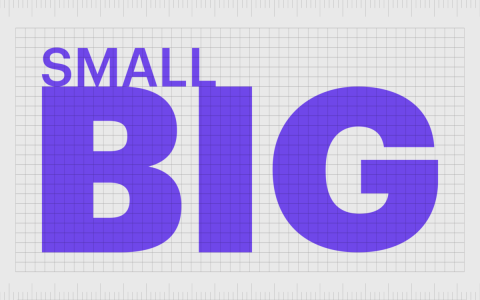
In addition to enhancing legibility, contrast also adds depth and visual interest to a composition. By juxtaposing light and dark shades or complementary colors next to each other, designers can create dynamic visuals that engage the viewer’s eye.
Contrast can also be used to convey mood or emotion within a design; for instance, using high contrast with vibrant colors may evoke energy and excitement while low contrast with muted tones could create a sense of calmness.
Overall, understanding how to effectively use contrast is essential for graphic designers seeking to create visually compelling designs that capture attention and communicate ideas effectively.
2. Balance
Achieving a harmonious distribution of elements in a design is essential for creating visual stability and unity. Balance, as one of the core fundamentals of graphic design, plays a crucial role in achieving this goal. It refers to the even distribution of elements within a composition, ensuring that no single element overpowers the others.
There are different types of balance that designers can employ, including symmetrical, asymmetrical, and radial balance.
Symmetrical balance involves arranging elements in an equal and mirrored manner on either side of an imaginary vertical or horizontal axis. This type of balance creates a sense of order and calmness in the design.
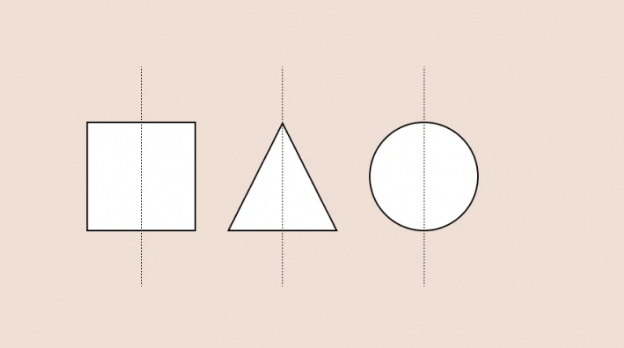
On the other hand, asymmetrical balance involves arranging elements unevenly but still maintaining equilibrium through careful placement and visual weight. It allows for more dynamic compositions and can create a sense of movement or tension.

Radial balance revolves around arranging elements around a central focal point, radiating outwards like spokes on a wheel. This type of balance is often used to create emphasis or draw attention to certain areas within the design.

By understanding and implementing these various types of balance, designers can effectively distribute elements throughout their designs to achieve visual harmony and coherence. Maintaining proper balance not only enhances the overall aesthetic appeal but also ensures that key messages are conveyed effectively to viewers while providing them with an engaging experience.
Therefore, mastering the principle of balance is crucial for graphic designers who seek to captivate their audience’s subconscious desire for innovative visuals.
3. Alignment
Alignment in design plays a crucial role in establishing visual connections between elements and creating a sense of order and organization within the composition. It is the process of positioning elements in relation to each other or to a common reference point, such as the edges of a page or the centerline.

By aligning elements, designers can create a cohesive and harmonious layout that guides viewers’ eyes smoothly across the design.
There are different types of alignment that designers can utilize, including left alignment, right alignment, center alignment, and justified alignment. Each type has its own unique effect on the overall composition.
Alignment not only enhances the aesthetic appeal of a design but also improves legibility and comprehension. When text is aligned consistently throughout a layout, it becomes easier for readers to follow along without feeling overwhelmed or confused.
Moreover, aligned graphics help establish relationships between different components within the design, ensuring that they work together harmoniously to deliver the intended message effectively.
By using proper alignment techniques, designers can create visually appealing designs that are easy to navigate and understand while maintaining an innovative edge that captivates their audience’s subconscious desire for novelty and creativity.
4. Proximity
The arrangement of elements in close proximity to indicate their relationship or connection, and is a vital principle in design that allows designers to create visual hierarchy and organize information effectively.
By placing related elements close together, designers can visually communicate their association and help viewers understand the message more easily. Proximity helps guide the viewer’s attention and allows for clear navigation through a design.
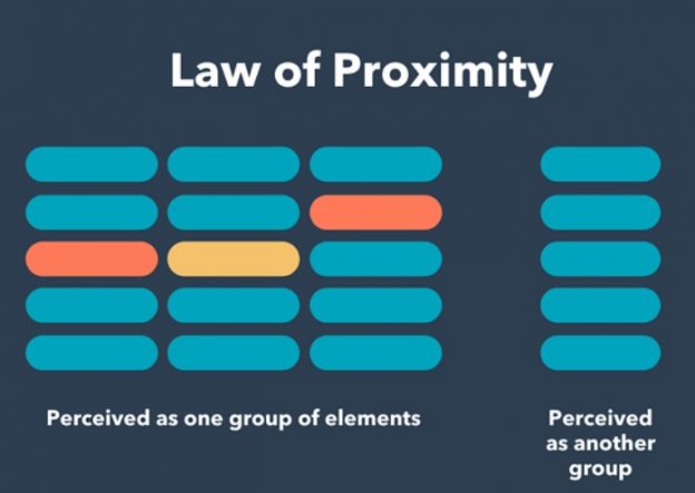
In graphic design, proximity can be used to group similar content or separate different sections.
For example, in a magazine layout, headlines and accompanying text are often placed close together to show their connection. Similarly, images and captions are grouped together using proximity to indicate that they belong together. By utilizing this principle, designers can enhance readability and ensure that viewers can quickly identify relationships between various elements.
Moreover, proximity plays a crucial role in creating visual hierarchy within a design. By grouping related elements together through proximity, designers can establish levels of importance or prioritize certain information over others.
This allows viewers to navigate through the design effortlessly and focus on key messages or important details. Without proper use of proximity, a design may appear cluttered or confusing, making it difficult for viewers to interpret its intended meaning.
5. Hierarchy
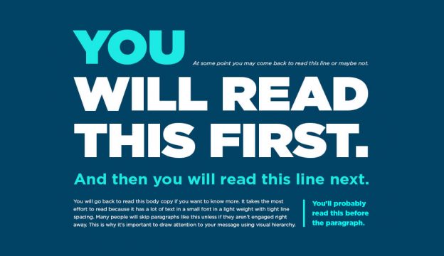
Hierarchy, as a fundamental concept in design, allows for the organization and prioritization of information by assigning varying degrees of importance to different elements within a composition. By establishing a clear hierarchy, designers can guide the viewer’s attention and create visual interest.
Here are four key aspects of hierarchy in graphic design:
.
Hierarchy plays a crucial role in graphic design by allowing designers to organize and prioritize information within compositions. Through careful consideration of size, position, color, and typography choices, designers create visual hierarchies that direct viewers’ attention and convey meaning effectively.
Harnessing these principles not only enhances legibility but also adds depth and clarity to designs. By mastering the art of hierarchy, designers can create innovative compositions that engage audiences on multiple levels while delivering impactful messages.
6. Repetition
Repetition, a vital concept in design, involves the use of recurring visual elements to create a cohesive and harmonious composition.
By repeating certain elements such as shapes, colors, lines, or patterns throughout a design, graphic designers can establish a sense of unity and rhythm.

This repetition not only helps to tie the various parts of the design together but also creates visual interest and engagement for the viewer.
Incorporating repetition in graphic design allows for consistency and reinforcement of key messages or branding elements.
It helps to strengthen the overall impact and memorability of the design by reinforcing important information or themes.
Additionally, repetition can be used strategically to guide the viewer’s eye through the composition, highlighting important elements and creating a clear visual hierarchy.
When employed effectively, repetition adds depth and complexity to a design while maintaining simplicity.
It is important for designers to carefully consider which elements should be repeated in order to achieve balance and avoid overwhelming or monotonous visuals.
By harnessing the power of repetition, designers can create visually compelling designs that captivate their audience and leave a lasting impression.
7. Rhythm
Rhythm in design orchestrates a harmonious dance between visual elements, seamlessly connecting them to create a captivating and cohesive composition. It brings a sense of movement and flow to the design, guiding the viewer’s eye from one element to another.

8. Emphasis
Emphasis in graphic design is a technique used to draw attention to specific elements within a composition. Designers achieve emphasis through strategic use of visual elements such as color, contrast, and placement to create a hierarchy of importance.

Contrast plays a crucial role in emphasizing elements by highlighting differences in size, color, or weight. Bold choices in typography or vibrant colors can serve as focal points, guiding the viewer’s gaze and conveying significance.
Emphasis is not an isolated concept but works in tandem with other design principles like proximity, alignment, and repetition. These principles contribute to a cohesive visual language, ensuring that the emphasized elements integrate seamlessly into the overall design.
By strategically employing emphasis, designers guide the viewer’s experience, creating a narrative flow within the design.
9. White Space (Negative Space)

White space, sometimes referred to as negative space, is like the quiet pause between musical notes that allows the melody to breathe and resonate, creating a sense of elegance and sophistication in a design composition. It is the empty or unmarked areas in a design that exist between or around elements.
While it may seem counterintuitive, white space plays a crucial role in graphic design by enhancing visual appeal and improving readability.
Here are three reasons why white space is an essential element in design:
1. Enhances Focus: White space provides clarity and helps guide the viewer’s attention to key elements in a design. By separating different elements and allowing them room to ‘breathe,’ white space helps prevent visual clutter and ensures that important aspects stand out.
2. Improves Readability: Proper use of white space can enhance legibility by giving text sufficient room to be easily read. Ample spacing between paragraphs, lines of text, and individual characters makes it easier for readers to absorb information quickly without feeling overwhelmed.

3. Creates Visual Balance: White space contributes to achieving balance in a design composition. By carefully distributing elements within the available space, designers can create a harmonious arrangement that is visually appealing and aesthetically pleasing.
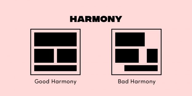
White space serves as an essential element in graphic design by providing focus, improving readability, and creating visual balance. Its strategic use enhances the overall aesthetic appeal of a design while allowing important elements to shine through with elegance and sophistication.
10. Movement
Flow is a key element in design that creates a sense of movement and guides the viewer’s eye through the composition. It is achieved by using various techniques such as lines, shapes, and patterns that lead the eye from one element to another.
Movement can be both literal and implied, depending on the intended effect of the design.

In literal movement, actual elements are used to create a dynamic visual experience. For example, diagonal lines or curves can create a sense of energy and motion.
Implied movement, on the other hand, uses visual cues to suggest movement without actually showing it. This can be achieved through the use of repetition, rhythm, or even strategic placement of elements.
In addition to creating visual interest and engagement, movement also helps convey messages effectively in graphic design. By guiding the viewer’s eye through the composition in a deliberate manner, designers can control how information is perceived and understood.
Movement can be used to emphasize important elements or create a narrative flow within the design. It adds depth and dimensionality to static images by giving them a sense of action or progression.
Ultimately, incorporating movement into graphic designs not only makes them visually appealing but also enhances their functionality by ensuring that they effectively communicate their intended message to viewers.
Overall, flow and movement are crucial aspects of graphic design that allow for innovation and creativity in conveying messages visually.
11. Variety
Variety in design refers to the inclusion of diverse elements, such as color schemes, typography styles, and imagery, which adds interest and visual appeal to the composition.
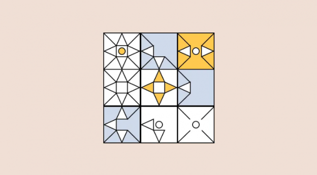
By incorporating different elements into a design, it creates a sense of dynamism and captures the viewer’s attention. Variety is essential in graphic design as it prevents monotony and engages the audience on multiple levels.
However, using variety should have a clear purpose. Random diversity doesn’t mean much. Instead, it should work with other design elements, making things look better together. This careful mix of variety makes the user experience better. It makes sure every design choice has a real purpose in the overall look.
12. Unity
Unity in design brings together diverse elements seamlessly, creating a cohesive and visually captivating composition that leaves a lasting impression on the viewer.
It is an essential principle of graphic design that aims to unify various elements within a design, such as color, typography, imagery, and layout. By achieving harmony, designers can create a sense of balance and coherence that enhances the overall aesthetic appeal.

To achieve unity in design, designers must carefully consider the relationships between different elements and ensure they work together harmoniously.
This can be achieved through various techniques such as repetition of shapes or patterns, consistent use of colors or fonts, and maintaining a clear visual hierarchy.
Unity helps guide the viewer’s eye throughout the design and ensures that all elements are working together towards a common goal. By incorporating unity into their designs, graphic designers can create visually engaging compositions that communicate effectively with their target audience.
Whether it is through consistent branding or conveying a specific message or emotion, unity plays a crucial role in capturing viewers’ attention and delivering an impactful visual experience.
The Relationship Between Graphic Design and Brand Identity
The relationship between graphic design and brand identity is a crucial factor in establishing a strong and memorable presence in the market.
Graphic design plays a pivotal role in conveying the essence of a brand through visual elements such as logos, typography, color palettes, and overall aesthetics. It helps create a cohesive and consistent visual language that represents the values, personality, and unique selling points of a brand.
Effective graphic design can contribute to building brand recognition and differentiation in a crowded marketplace. By using distinct visual elements that are aligned with the brand’s identity, graphic designers can help create an immediate connection with target audiences.
Consistency in design across various touch points like websites, packaging, advertisements, social media platforms ensures that consumers can easily recognize and associate these visuals with the brand.
Furthermore, graphic design has the power to evoke emotions and shape perceptions about a brand.
The use of specific colors or imagery can communicate certain feelings or associations that resonate with consumers on an emotional level. A well-executed graphic design strategy can elicit trust, credibility, and positive sentiments towards a brand.
Graphic design is not just about creating visually appealing designs; it plays an integral role in shaping how brands are perceived by their target audience. By leveraging effective graphic design principles to align with their brand identity consistently across different platforms and channels, brands can establish themselves as innovative leaders within their respective industries.
Conclusion
In conclusion, graphic design is an essential skill in the advertising and marketing industry. By mastering the four core fundamentals and twelve basic principles of graphic design, individuals can create visually captivating designs that effectively communicate their message.
Understanding how graphic design relates to brand identity allows designers to effectively promote brands through their creative work.
Aspiring graphic designers can benefit from taking courses that cover branding and computer graphics as these provide a solid foundation for success in this field.
By acquiring knowledge in these areas and applying the core fundamentals and principles of graphic design, individuals can showcase their creative skills and capture the attention of their target audience.
Ultimately, graphic design plays a crucial role in promoting brands effectively and creating visually appealing designs that leave a lasting impact on viewers.
Want to leave a lasting impression on your audience? We always use all the fundamentals and principles we talked about today in order to create consistent and great work that will make you stay at the top of your customers’ minds. Give us a call today.
Frequently Asked Questions
What are the key skills required to excel in graphic design?
To excel in graphic design, key skills include creativity, technical proficiency in design software, an understanding of branding and marketing principles, attention to detail, the ability to communicate effectively, and a strong sense of visual aesthetics.
How does graphic design contribute to the success of a brand?
Graphic design contributes to the success of a brand by visually communicating its values, message, and identity. Through the use of graphics, colors, and layout, it helps create a memorable and recognizable brand image that connects with the target audience.
Are there any specific design principles that are more important than others?
No specific design principles are more important than others. Each principle, such as balance, alignment, hierarchy, contrast, rhythm, proximity, color, and space, plays a vital role in creating visually appealing and effective designs that captivate audiences and enhance brand success.
What are some common mistakes to avoid in graphic design?
Common mistakes to avoid in graphic design include poor alignment, lack of contrast, overcrowding elements, inconsistent use of color and typography, ignoring hierarchy and balance, and neglecting to consider the target audience.
How can graphic design be used to effectively communicate a message or story?
Graphic design effectively communicates a message or story by utilizing various techniques such as balance, alignment, contrast, and rhythm. By strategically using color, space, and proximity, designers can create visual elements that engage and captivate audiences.


