
Graphic design is powerful for connecting brands with their target audience. It is an essential part of creating a brand identity and can be used to represent the values that the company stands for. When done right, it can give companies an edge over their competitors and make them stand out from the crowd.
These graphic design tips are generally aimed at helping you improve the overall quality of your design work. They encompass a range of considerations, including both technical and conceptual aspects of design.
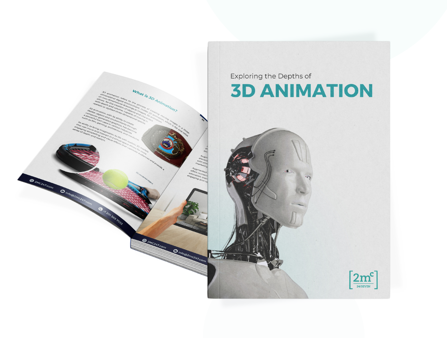
This article will provide twelve easy graphic design tips that will help companies effortlessly connect with their target audience and create a lasting impression on them.
Let’s begin!
Easy Graphic Design Tips Anyone Can Use

Understand Your Target Audience
By gaining an understanding of the needs and interests of their target audience, businesses can create a connection that resonates on a deeper level.
To do this, they must begin by conducting audience segmentation research to identify who their ideal customers are, what motivates them, and what drives their buying decisions.
Once they have identified this information, businesses can then use client research to collect insights about the design trends that appeal most to their target market.
This is the first step any brand should take before creating their designs for the mass market.
By taking these steps, companies can create marketing materials that not only stand out from the competition but also make an effortless connection with their intended demographic.
Seek Feedback
Gathering insights from potential end-users or current customers through evaluating feedback, developing surveys, analyzing results, getting opinions, and planning changes is essential in creating an attractive design that resonates with the target audience.
This is crucial for several reasons:
Audience Relevance
Understanding the preferences, tastes, and expectations of your target audience ensures that your graphic design is relevant to them. This relevance increases the likelihood that your design will resonate with the audience and effectively communicate the intended message.
User Experience
Gathering feedback allows designers to assess the user experience of their designs. This includes factors such as ease of use, clarity, and overall satisfaction. By analyzing feedback, designers can identify areas for improvement and make adjustments to enhance the user experience.
Effective Communication
Graphic design is a form of visual communication. By gathering insights from potential users, designers can tailor their designs to effectively convey the desired message. This ensures that the design not only looks visually appealing but also communicates the intended information or emotion.
Problem Identification
Feedback and surveys help in identifying any issues or concerns that users may have with the design. This could include issues with readability, color choices, or overall layout. Identifying and addressing these issues early in the design process can lead to a more polished and effective final product.
Market Competitiveness
In a competitive market, understanding the preferences and expectations of your audience can give you a strategic advantage. Designs that align with what your audience values are more likely to stand out and be memorable, contributing to the overall competitiveness of your product or brand.
When businesses utilize these strategies, they can create powerful graphics that help build strong relationships with their target audience while also delivering high-quality content in an engaging style for an audience that has a subconscious desire for innovation.
Maintain Consistency
Maintaining consistency in graphic design is paramount for effectively bridging the gap between a brand and its intended audience.

Achieving this involves using fonts wisely, exploring typography, experimenting with textures, focusing on branding, and creating hierarchy.
Doing so can help to create an aesthetically pleasing visual that resonates with a target audience’s subconscious desire for innovation.
Fonts should be consistent throughout all of a brand’s marketing materials; however, it is also important to consider how typefaces can be used to highlight certain information or evoke particular emotions from viewers.
Typography should be explored in order to find legible fonts that are creative enough to garner attention but subtle enough not to detract from the message being communicated.
It is also essential for designers to focus on creating a cohesive brand identity by utilizing color schemes and logo designs that are easily recognizable and memorable for viewers.
By following these tips, brands will have the tools necessary to connect with their audiences through graphic design elements that remain consistent across multiple platforms and formats.
Use a Small Color Scheme
Limiting the number of colors used in a design can help create a visually stimulating yet cohesive look. By applying color theory and visual hierarchy, designers can use a small color scheme to effectively communicate their brand identity and message.

This requires careful thought and consideration for each element of the design such as font selection, contrast ratio, saturation levels, etc.
The use of a limited color palette provides clarity to the user experience by allowing them to easily identify key elements within the design. Additionally, it helps keep consistency across all mediums which is paramount when creating a successful brand identity that resonates with your target audience.
A small color scheme should be carefully planned out ahead of time since changing colors later on can be difficult and costly in terms of both money and time.
Prioritize Readability
Prioritizing readability in a design can ensure an intuitive and enjoyable experience for the user.
For example, when designing a website, using high-contrast colors and large fonts helps create a clear navigation path that will draw users into the content. When choosing fonts, take into account how readable they are on different devices.
Utilize shapes to highlight key content areas and draw attention to important information.
Additionally, assess the impact of each element used in terms of readability – if it detracts from clarity or makes navigating difficult then consider removing it or adjusting it accordingly.
Ultimately, prioritize clarity over aesthetic appeal to ensure maximum user engagement with your design.
Whitespace Matters

Incorporating whitespace effectively into a design can create an aesthetically pleasing and organized layout. To do this, designers must use dynamic fonts, visual hierarchy, emphasis effects, text styling, and well-balanced elements to ensure that the whitespace is used in a way that emphasizes the purpose of the design.
By using these techniques, designers will be able to utilize whitespace as a tool to focus attention on certain areas of the design or create separation between different elements. Additionally, effective use of whitespace can provide an engaging experience for viewers by creating a sense of dynamism and fluidity in the layout.
Achieving this goal requires careful consideration of color palettes and font size choices when designing anything from logos to websites. By making sure there is enough free space between various components within designs, designers are able to play with light and dark colors while adding emphasis effects such as shadows or outlines as desired.
Use High-Quality and Crisp Images
High-quality and crisp images can contribute to a visually engaging experience, allowing viewers to appreciate the design with greater clarity.
To ensure that your visuals have maximum impact on your target audience, consider optimizing them in several key ways:
Doing so will help you create an emotional connection with your audience, while ensuring a successful representation of your message through graphic design.
Be Intentional About Alignment
Strategic alignment can help to create an effective representation of a brand message. Optimizing alignment allows for the establishment of flow, designing a hierarchy, creating structure, and setting priorities in graphic design projects.
For example, when creating an advertisement or poster it is important that the elements are properly aligned in order to draw the viewer’s attention.

Alignment helps create visual connections and emphasize certain elements within the overall design.
Furthermore, intentional alignment also helps with readability by providing clarity between different sections of text or images.
By opting for simple symmetrical lines and aligning visuals in blocks on either side of a central point or line, designers can establish a sense of balance and stability throughout their work.
Additionally, using grids as guides for positioning images within larger designs will improve accuracy in placement while allowing for greater creativity.
Finally, adjusting margins and padding around objects will allow more sophisticated layouts with improved flow between elements on the page as well as better spacing consistency across all devices used to view them.
All these techniques provide invaluable tools for efficiently connecting brands with their audiences through graphic design projects.
Experiment with Layouts
The creative flow of a layout can be enhanced by selecting fonts that complement one another and establishing a visual hierarchy between elements.
As you play with visual hierarchy, you’re able to guide the viewer’s eye through the design. Feel free to explore different arrangements of elements to emphasize key information. Adjusting the size, color, and placement of text and images can create a sense of flow and importance.
A well-thought-out hierarchy not only enhances the visual appeal but also ensures that the message is conveyed effectively.
As you experiment with layouts, another thing you’ll want to consider is how your design responds to different devices and orientations. Test your layouts on various platforms to ensure a seamless user experience. Embracing responsive design principles opens up new creative possibilities and ensures your work looks compelling across a range of mediums.
Simplify Complex Ideas
Research suggests that effectively simplifying complex ideas can help to capture and maintain the attention of a target audience, with nine in ten people reporting they are more likely to share content that is easy to understand.
To emphasize clarity and focus on meaning, it is important for brands to avoid clutter by using simple visuals or design elements when conveying their message.
Additionally, by balancing visuals with meaningful words, brands can create an impactful graphic design piece that connects easily with their target audience.
By doing this, brands can make sure their message is understood quickly and clearly without having to decipher complicated graphics or text.
Leverage Contrasting Colors to Draw Focus
Contrasting colors is one of the most counterintuitive but very effective graphic design tips.
By contrasting colors, brands can draw attention to their message and create a powerful visual impact.
Through strategic color selection, brands can use color psychology to subconsciously engage with their audience and communicate their desired message.
A properly contrasting palette can also ensure your designs are both aesthetically pleasing and accessible.
To successfully leverage contrasting colors for visual impact, brands must understand the fundamentals of color psychology and how it relates to font selection and contrast ratios.
As You Design, Don’t Forget About Mobile

When creating visuals, it is essential to bear in mind the ever-growing range of mobile devices and their various screen sizes. Mobile optimization is a critical part of graphic design that should not be ignored.
It requires making time for mobile development, understanding available content for mobile websites and applications, staying up to date with current trends in mobile design, and providing an optimal user experience to viewers across all screens.
For those who don’t have prior experience with designing for mobile, there are many resources available to help make the transition easier. Optimizing content and images for small screens can be achieved by implementing techniques such as using vector art instead of bitmap images or adjusting font size according to device type.
Additionally, leveraging responsive design principles helps ensure a consistent look and feel across multiple devices while also optimizing loading times for visitors on slower connections or older models.
Following these graphic design tips will ensure that your brand’s graphics remain engaging and optimized no matter which device they are viewed on.
Conclusion
The impact of graphic design is immense. It is the visual representation of a brand and can influence how customers perceive a business.
In order to create an effective connection with the audience, it is important to understand their needs and preferences. Designers must also use contrast, color scheme, readability, layouts, and simplicity to effectively communicate an idea or message.
A successful design should capture viewers’ attention while seamlessly conveying the brand’s narrative. Ultimately, thoughtful graphic design creates meaningful experiences for audiences that are powerful enough to build relationships between brands and consumers alike.