Graphic design is a rapidly evolving field. To help top brands stand out in today’s competitive market, professionals must employ a variety of techniques that captivate and engage audiences.
From simplicity to color psychology, typography to negative space utilization, the ten graphic design techniques we’ve listed have been perfected by the pros to create visually stunning designs for top brands that leave a lasting impression on their audience and increase their conversions.
By employing these graphic design techniques creatively, any excellent graphic designer can make their client’s brand stand out from the competition and attract their own following.
Today we’re going to explore what those techniques are and why they are important.
Let’s begin.
What is Graphic Design?
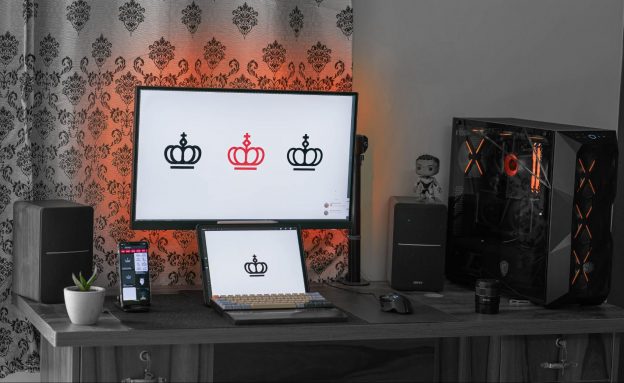
At its core, graphic design is the art and science of visually communicating ideas, information, and messages. It’s the creative process of using images, text, colors, and layout to convey a concept in a way that is not only aesthetically pleasing but also effective in reaching and engaging the intended audience.
Graphic designers are visual storytellers. It is their job to consider the brand’s audience, the purpose of the message, and the medium through which it will be communicated, before creating a design.
Whether it’s a logo, a website, a poster, or a social media graphic, graphic design techniques are the invisible force that transform ordinary designs into something that is more visually compelling and memorable in the mind of your audience.
The Importance of Graphic Design Techniques
Graphic design techniques are specific and detailed methods or approaches that designers use to achieve certain visual effects or outcomes. These techniques often involve a deeper level of understanding and application of design principles that contribute to the overall execution of a design.
Understanding and implementing various graphic design techniques can significantly enhance the visual appeal and distinctiveness of top brands.
Impact of Graphic Design on Branding
The impact of design on branding cannot be underestimated.
A well-designed logo or website can instantly communicate a brand’s values, mission, and personality. It serves as a visual representation that connects with consumers on an emotional level.
Excellent graphic designers make use of different design principles to deliver great results for their brands and that of their clients. These principles allow designers to manipulate elements such as typography, layout, and imagery to create unique compositions that are both aesthetically pleasing and impactful.
Understanding and implementing graphic design techniques is crucial for creating top brands that stand out in today’s competitive market. The value of aesthetics cannot be overlooked as it directly influences how consumers perceive a brand.
Through innovative design choices that reflect a brand’s values and personality, professionals can create designs that captivate audiences while leaving a lasting impression on their minds.
The 10 Graphic Design Techniques To Make Your Brand Stand Out
Simplicity
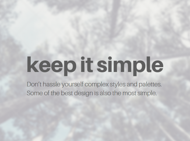
Simplicity in graphic design is a powerful and timeless technique that greatly contributes to making a brand stand out. The principle of simplicity revolves around the idea that clear, uncluttered designs are more memorable, effective, and aesthetically pleasing.
Simplicity involves eliminating unnecessary elements and creating a clean, uncluttered design that allows the viewer to easily understand and navigate the content.
This is achieved through various alignment techniques, creative trimming, blurring effects, anti-aliasing methods, and adding artifacts.
By using these various design elements strategically, designers can create a sense of order and balance that enhances the overall aesthetic appeal. They also maximize space and allow for more content to be displayed without compromising readability or clarity.
Overall, simplicity in graphic design is not about minimalism for its own sake but rather about creating designs that are visually appealing, easy to navigate, and effectively communicate their intended message.
Composition
Composition in graphic design refers to the arrangement and organization of visual elements within a design. Effective composition is crucial for creating visually appealing and impactful designs.
Here are some key rules of composition that designers often follow to make brands stand out:
Rule of Thirds
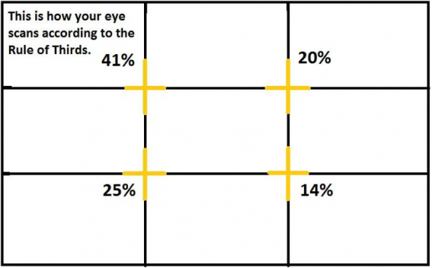
The Rule of Thirds divides the design space into a 3×3 grid, emphasizing the intersections and lines. It guides placement to create balanced and visually appealing compositions.
Designers place key elements along these gridlines or at intersections to achieve balance and engage viewers effectively.
Hierarchy
Visual Hierarchy establishes an order of importance within a design, guiding the viewer’s eye through varying levels of emphasis on different elements.
Designers use contrast in size, color, and position to create a clear hierarchy, ensuring that essential elements stand out prominently.
Balance
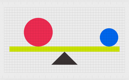
Balance in design refers to the distribution of visual weight to create stability. This can be achieved through symmetry, asymmetry, or radial balance.
Designers strive for equilibrium in design elements, choosing the appropriate balance type based on the visual impact they want their designs to have.
Unity
Unity is the cohesive integration of all elements, ensuring a harmonious and consistent visual experience.
Designers maintain unity through consistent use of style, color, and typography, reinforcing the brand’s identity and visual coherence.
Focal Point
The focal point is the central area of emphasis within a design, capturing the viewer’s attention and guiding their gaze to a specific element or message.

Designers strategically position key elements, such as vibrant colors, unique shapes, or compelling imagery, to create a focal point that serves as the visual anchor, enhancing the overall impact and message clarity of the design.
By incorporating these various composition techniques into their designs, professionals are able to elevate brands and captivate audiences with visually stunning visuals that convey powerful messages effectively.
Layout
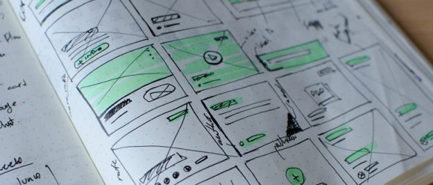
Layout in design is the process of arranging visual elements – like text, images, and shapes – on a given page. A good layout is important for any project that conveys a message through eye-catching visuals, like magazine layouts, website design, and advertisements.
Good layout design is both dynamic and clear, creating visual points of interest that guide the reader through a piece of content without overshadowing its message.
When it comes to creating visually appealing designs, professional graphic designers rely on various design principles and techniques (like alignment, visual hierarchy, use of grid systems and space) to make top brands stand out.
One commonly used technique is the implementation of grid systems.
Grid systems provide a structured framework that allows for consistent alignment and placement of content.
By dividing the design space into a series of columns and rows, designers can easily organize and arrange elements such as text, images, and graphics. This not only ensures visual harmony but also enhances readability and navigation for the viewer.
The Difference Between Layout and Composition
For the uninitiated, it’s easy to confuse Composition and Layout up in the context of graphic design, but there is a major difference.
In graphic design, the distinction between layout and composition lies in their respective focuses and applications.
Composition centers on the artistic arrangement and interplay of visual elements within a singular work, emphasizing principles like balance and harmony to evoke a specific aesthetic response.
On the other hand, layout pertains specifically to the strategic organization of these elements within a given space, be it a page, screen, or any designated area.
Layout is concerned with the practical and functional aspects of design, aiming to guide the viewer’s eye systematically, enhance readability, and ensure an efficient flow of information.
While composition is about the overall artistic cohesion, layout is the deliberate structuring of elements to serve a communicative or informational purpose, making the two integral but distinct components of effective graphic design.
Color Psychology
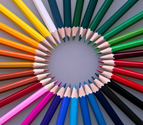
Color psychology investigates how colors can affect human emotions and behaviors, and it plays a crucial role in the visual composition of designs. Graphic designers leverage an understanding of color symbolism to strategically evoke specific reactions from viewers.
Different colors elicit varied emotions, forming distinct layers of color psychology. Red symbolizes passion, blue radiates calmness, yellow exudes happiness, and green embodies growth. These emotional triggers serve as a foundation, allowing designers to create a nuanced visual language.
Cultural nuances further complicate color choices.
For instance, while white signifies purity in Western cultures, it symbolizes mourning in certain Eastern cultures. Red, synonymous with luck and prosperity in Chinese culture, can signify danger in other contexts. Navigating these cultural subtleties is essential for resonating with diverse audiences effectively.
And then there’s color theory. Color theory is a set of principles that explores how colors interact and impact each other. It involves understanding the color wheel, which organizes colors based on their relationships.
At a deeper level, color theory enhances the designer’s toolkit. Complementary colors, positioned opposite each other on the wheel, create dynamic contrast and emphasize visual elements. Analogous colors, adjacent on the wheel, foster harmony by sharing similar hues. Additionally, considering factors like brightness, saturation, and temperature refines the color selection process.
Understanding these interplays allows designers to craft compositions that resonate on multiple levels. By integrating color psychology into graphic design, professionals tap into the power of color symbolism, creating visually compelling works that align with viewers’ desires for innovation and creativity.
Typography
Typography, the art and technique of arranging type to make written language legible, readable, and visually appealing, is a critical element in the overall design composition.
When it comes to typography in graphic design, there are several techniques that professionals use to create standout brands.
Font Selection

First and foremost is font selection. Choosing the right font can greatly impact the overall look and feel of a design. Different fonts convey different emotions and messages, so selecting one that aligns with the brand’s personality is crucial.
Kerning
Another important aspect of typography is kerning techniques. Kerning refers to adjusting the spacing between individual letters to achieve a visually pleasing result. Proper kerning ensures that each letter flows seamlessly into one another, creating a harmonious visual balance.
Typography Hierarchy
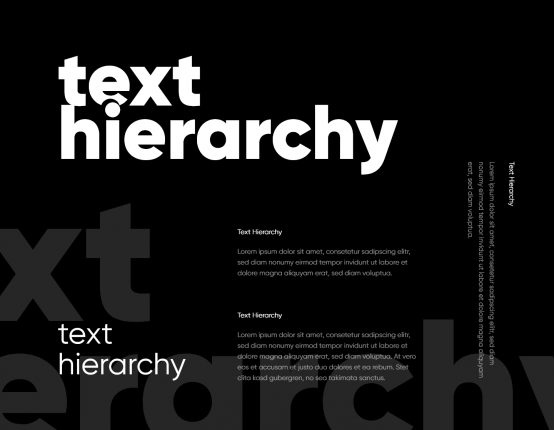
Typography hierarchy is also essential in creating an effective design. This involves organizing different elements of text based on their importance or significance within the layout.
By using varying font sizes, weights, and styles, designers can guide viewers’ attention to key information and create a sense of hierarchy within the text.
Ligatures & Symbols
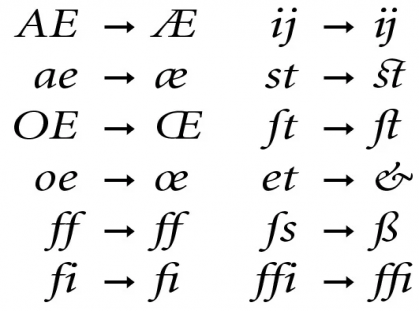
Lastly, incorporating ligatures and special characters adds an extra touch of sophistication to typographic designs. Ligatures are unique combinations of two or more letters that are designed as a single character for aesthetic purposes. They help add elegance and uniqueness to typography while maintaining readability.
Typography plays a crucial role in graphic design by not only making written language legible but also adding visual appeal to designs. Through careful selection and strategy designers can create standout brands that captivate audiences with their innovative use of typefaces.
Consistency
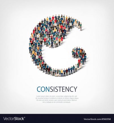
Consistency plays a crucial role in branding as it helps maintain a strong visual identity for a brand.
By maintaining consistency in elements such as color palette, typography, and layout, companies create a recognizable brand that differentiate them from their competitors.
When viewers encounter consistent branding across different platforms, they are more likely to develop brand recognition and recall. This means that when they see the company’s logo or other design elements, they immediately associate them with the brand, creating a lasting impression.
To achieve brand consistency across different platforms, graphic designers need to establish style guidelines that outline the specific colors, fonts, and other design elements to be used consistently.
These guidelines serve as a reference point for all future designs and ensure that every piece of content aligns with the overall brand identity. Adhering to these guidelines creates an instantly recognizable and memorable presence in customers’ minds that make it easy for top brands to stand out.
Storytelling through Imagery
Professional graphic designers easily communicate a narrative and evoke emotions in viewers by strategically incorporating visual elements that convey meaning and create a captivating visual experience.

By utilizing various storytelling techniques, designers can effectively convey messages and engage their audience.
One common method is the use of illustrations, which can depict characters and scenes that bring a story to life. Illustrations add depth and personality to a design, allowing viewers to connect with the visuals on a more emotional level.
Another approach is using photography, which captures real-life moments and authentic emotions.
In addition to illustrations and photography, infographics are another useful tool for visual storytelling.
Infographics combine data-driven information with compelling visuals to present complex concepts in an easily digestible format. By simplifying data through charts, graphs, and illustrations, infographics make information more accessible and engaging for viewers. They allow graphic designers to tell stories through data visualization while maintaining clarity and impact.
Overall, storytelling through imagery is a powerful technique that helps designers create memorable experiences for their audience.
Negative Space Utilization

Whitespace, the empty space between design elements, can be strategically utilized to create a visually captivating and harmonious composition.
Negative space techniques involve intentionally leaving areas of a design blank or unoccupied, allowing the surrounding elements to stand out and communicate more effectively. By balancing elements and optimizing whitespace, designers can achieve a minimalist design that not only looks clean and modern but also provides visual breathing room for the viewer.
One of the key negative space techniques is to use whitespace as a way to create emphasis and draw attention to important elements. By leaving ample space around an object or text, it becomes more prominent and easier for the viewer to focus on. This technique can help guide the viewer’s eye through the design and highlight key messages or calls to action.
Additionally, utilizing negative space can enhance clarity and legibility by separating different elements from each other. It creates a sense of organization and prevents overcrowding, making it easier for viewers to navigate through the design without feeling overwhelmed.
Contrast & Visual Hierarchy
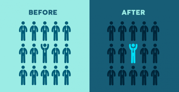
Contrast and visual hierarchy are graphic design techniques that are important when creating designs that effectively guide the viewer’s attention and communicate information.
When it comes to contrast, visual weight is a factor graphic designers have to take into consideration. Visual weight refers to the perceived importance or dominance of elements within a design.
By strategically using color contrast, designers can manipulate the visual weight of different elements to create emphasis and establish a focal point. This helps direct the viewer’s gaze towards key information or important elements in the design.
When it comes to visual hierarchy, designers often employ various principles such as size, color, typography, and spacing. These principles help organize different elements within a design by establishing levels of importance and guiding the viewer’s eye through the composition.
By utilizing these hierarchy principles, designers can ensure that key information stands out and is easily distinguishable from less important elements. This not only enhances readability but also creates a sense of structure and clarity in the overall design.
Emphasis techniques are another powerful tool in creating contrast and visual hierarchy. Designers can use techniques like bold font styles, bright colors, or unique shapes to draw attention to specific areas or messages within a design. These techniques help create focal points that immediately capture the viewer’s attention and steer their focus towards important content.
Repetition
Repetition plays a crucial role in branding, advertising, logo design, packaging, and social media graphics. Repetition simply means using repeated elements or patterns throughout a design.
When designers do this, they establish consistency, reinforce brand identity, and create a sense of unity in their designs.

In branding, repetition helps to build recognition by consistently presenting the same colors, fonts, or visual motifs across different touchpoints. This allows consumers to easily associate these elements with the brand and form a lasting impression in their minds.
In advertising campaigns, repetition is often used to drive home key messages or slogans. Repeating phrases or visuals can increase memorability and ensure that the desired information is effectively communicated to the target audience.
Additionally, repetition can be employed in logo design to create strong visual impact and make logos instantly recognizable. Through consistent use of shapes or symbols within the logo design itself or in its application across various marketing materials, brands can establish a strong visual identity.
Conclusion
The value of aesthetics cannot be overlooked, as it directly influences how consumers perceive a brand. The graphic design techniques explored in this blog are the secret ingredients used by professionals to create brands and make them stand out in a competitive market.
Through mastery and artful combination of these techniques, graphic designers can transform ordinary designs into memorable visual experiences.
As professionals implement these techniques, they not only make brands stand out but also create designs that resonate, engage, and leave an indelible mark on the minds of their audience.
So, whether it’s a logo, a website, or a social media graphic, the journey to creating unforgettable brands begins with understanding and using these graphic design techniques in your own design.
